Wednesday, April 8, 2009

Wet Glazing


Wet glazing is an exciting watercolor technique. This technique is used for painting sunrises and sunsets and, although it is very difficult to control, can produce wonderful effects. The images that you see above are two ways to paint with wet glazes. Believe it or not, both paintings are painted with the same three colors: cadmium yellow light, permanent alizarin crimson, and colbalt blue. This includes not only the skies, but also the surf, the birds, and the landscape details.

In the top painting, the glazes were applied in thin layers. In the bottom painting, they were applied with varying intensity in different areas. To get the wet glazing effect in the top painting, start with the cadmium yellow light. Mix lots of water into the paints. On dry paper, apply a thin layer of the yellow evenly over the whole paper. Let it sit for a minute or two, then apply a thin layer of the permanent alizarin crimson. Let that glaze sit for a minute or two and then apply the cobalt blue layer. It may not look great while it is still wet, but when the pigments separate out of the binder and drop into the paper crevasses, the painting starts to glow.

To paint the bottom painting, start with the cadmium yellow light and apply it in various thicknesses on parts of the paper. You can paint a graded wash from the top or the bottom. Here I put lots of yellow right in the middle and graded it up and down. Then apply the permanent alizarin crimson, again in thicker and thinner paint in graded washes around and over the yellow. The final layer is the cobalt blue, again applied in various thick and thin layers on only parts of the painting.

Once the background wet glazing has been painted, you can start adding in details. This can be done while the glazes are still wet by lifting or adding darker paint. Or you can wait until the painting has dried. It is a wonderful technique, but let me warn you, it is almost impossible to truly predict what you will get once it dries!

Tuesday, January 20, 2009

Saving Whites


There are several ways that I save whites by using methods to block out parts of the paper. But I really prefer to paint around the whites. I think that it is mainly laziness that motivates me to work that way. The methods used to protect the white of the paper take time and none of them are ideal. Each has its own set of problems and masked areas almost always need to be repainted. The image above shows details from three paintings. The whites were saved by the following methods.

To preserve the whites in the close-up on the left, I masked the ripples in the water and the highlights on the rocks with a liquid frisket or masking fluid. I have used several different brands, but I currently prefer White Mask. The benefits of using a masking fluid is that it can be applied to very small areas. You do need to be careful that the white area is completely covered so that any washes of color do not leave splotches of color where you do not want them. The biggest problem using masking fluid occurs when you remove it. The edges can be harsh and not as clean as you had hoped. Plus the bright white areas look crude and out of place. I always rework the edges and often add tone into the bright white areas.

The dead tree in the middle was blocked with masking tape. I like using masking tape because it is quick and I have become very skilled in tearing and shaping the tape to go around curves and to make complex branches. I also like the sharp strong edges that you get with the tape. But as with the masking fluid you need to be careful and make sure that the tape is covering what you want to keep white. Masking tape can tear the paper when you remove it and wet paint often bleeds under the edges of the tape. Use your fingers to press down the edges of the tape, but make sure that you are either using removable masking tape or make it less sticky. To remove some of the glue on very sticky tape, use it to pick the lint off of your clothing. Press the piece of tape a couple of times onto your jeans and presto you now have removable tape!

To save the whites in the detail on the left, I painted around them. Because I wanted soft edges, it was my only option. You can control where your paint flows by the areas you moisten with clear water for a wash. I left the white areas dry. This meant that my background color flowed into the wet areas, but stopped when it came to the dry paper. I used clear water to soften the edges of the background where it met up with the white areas. When the painting was dry, I laid in very light washes in the white area to suggest the delicate fiber on the milkweed seeds. © Joan Wolbier 2009

Monday, January 12, 2009

Snow is not White


In my last post I talked about how whites are not white. Today I am saying that snow is not white. Today is a perfect day in Boulder to test that. When I woke up this morning it was snowing, really snowing, and we already had about three inches. To test the "color" of snow, take a white piece of paper and compare it to the snow. The snow I am seeing out my window is "pinkish" and "yellowish" compared to my white paper. The shadows are a warm gray. Because there is no bright sunshine, all of the shapes in the snow have very little contrast or value change.

Snow has very different colors when the sun is shining as you can see in the painting "Colorado Sunrise." Shadows define what snow looks like. Soft shadows define the shapes of piles of snow or snowbanks. When the sun is shining, strong cast shadows follow the contours of the snow. These shadows reflect the sky and if the sky is blue, these shadows can be bright blue and often appear garish. One watercolor artist painted her shadows turquoise and it was one of the most interesting and beautiful snow painting I have ever seen.

Because my painting is about the sunrise, the sun is not yet very strong and the shadows have soft edges. The value shift between the snow and the cast shadows is not as strong as it would be in bright sunlight and the color of the shadows is more muted, a "purplish" gray. Because whites reflect what is around them and snow is white, its colors change constantly. Spend time looking at snow and thinking about the "ish" colors. That is the best way to learn how to paint it. © 2009 Joan Wolbier

Monday, January 5, 2009

Whites are not White!


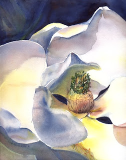
On January 8, 2009, I am starting a series of watercolor workshops that will focus on how to paint whites. The first of these lessons will demonstrate how to make a white shape three-dimensional. As you can see, this is a white flower, but it moves in and out of the flat space of the paper.

To paint whites, artists have to be aware, first of all, that whites are not white. Artists also have to learn a new language, the language of “ish” words. They have to become very sensitive to describing the type of white. This is a great lesson in learning to see color. For example, is that white “green-ish” or “pink-ish” or “blue-ish?” Because whites reflect color around them, the artist has to be sensitive to these “ish” colors. But sometimes these colors are not so subtle. The most amazing shadows I ever witnessed occurred one morning when I was lying in bed. The sun was streaming into the room and the ceiling fan over my bed cast a double shadow onto the white ceiling. One shadow was bright green and the other was deep red. It took me a while to figure out that the color for those shadows was being picked up from the colorful quilt on my bed!

Study this painting of the magnolia blossom. How many different “whites” can you see? Isn’t it amazing that our brain identifies which areas are white and which are not, even though some of the white areas are painted blue? Try to imagine how this painting would look if all my shadow areas were painted grey. Would the painting be as interesting?